Unshakably Herself
Rebranding an athletic clothing company and launching its first supplement line — a unified, premium identity for Power Woman.
Project Manager
7 people
5 weeks
Branding · Rebranding · Product Launch
Slack (communication), FigJam (collaboration)
Discover, Define, Develop, Deliver
Overview
Power Woman, a company selling athletic clothing for women, came to us for a rebrand. Their existing identity leaned colourful and pattern-heavy, and they wanted to move toward something more unified and holistic, alongside the launch of their first product outside of clothing: a sports supplement line. As Project Manager, I led a 7-person team through research, brand direction, and creative development across a 5-week sprint.
The Challenge
From our first meeting with the client, the brief broke down into six objectives:
- 01Build a unified and elevated brand identity — logo, typography, colour palette, and art direction — that expresses both power and femininity.
- 02Redefine the supplement brand and its packaging, aiming for a minimal, premium, and educational direction — something customers would want to display in their kitchen.
- 03Establish a visual tone that’s simple, powerful, and feminine: premium yet accessible.
- 04Build a full content strategy connecting education, performance, and lifestyle: product explanations, training routines, wellness tips, and expert-driven storytelling.
- 05Another layer of complexity: a woman’s body isn’t the same as a man’s, and its needs are different too. Most sports supplements on the market are designed around a male physiology, so the brand also needed to communicate why this product was built specifically for women, not just repackaged for them.
1.Discover
In every project, I like to keep a “parking lot” somewhere in our collaboration tool, a space where any idea can be dropped the moment it comes up. Ideation needs to happen at the right time, not whenever inspiration strikes and derails the current focus. So we park it, protect the momentum of the project, and come back to it when it’s actually time to ideate.
Research across roles and subjects
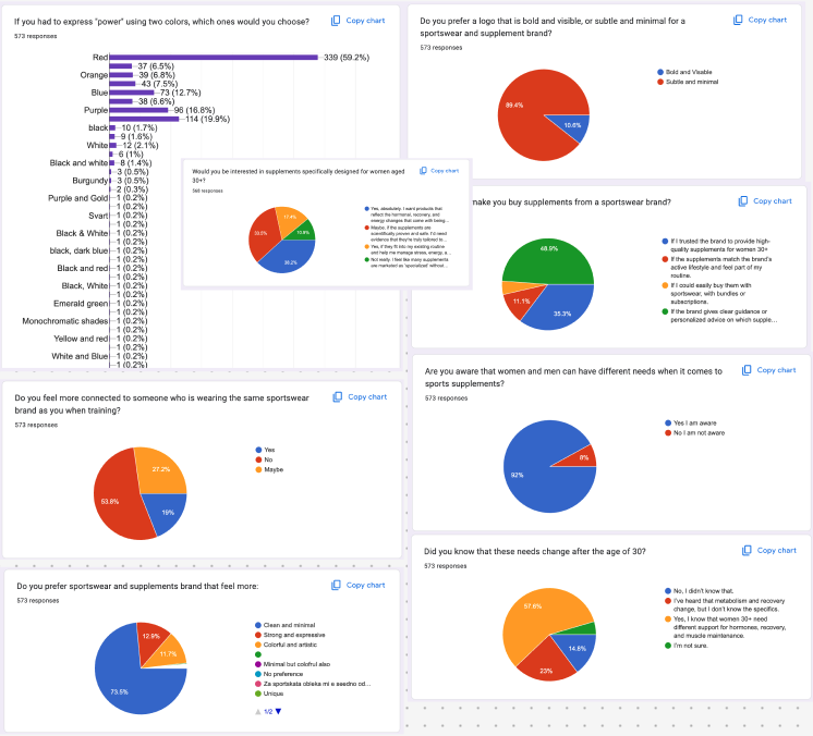
As with previous projects, I split the team’s research across roles and subjects to cover as much ground as possible. We had access to the client’s existing customer survey data, but also designed and ran our own survey, focused specifically on branding: colour perception, what colours mean to women, and what power means to them personally. That survey reached over 500 women, and became a key input for shaping the brand direction.
2.Define
Stylescapes and direction
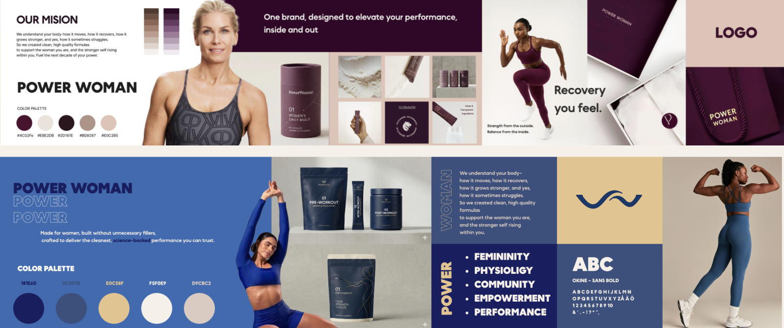
We translated our research into a set of stylescapes for the client to react to, alongside a look at their old branding for comparison. From those options, the client clearly gravitated toward a burgundy-led direction, striking the balance the brief called for: powerful, premium, and feminine, without leaning into the busy, pattern-heavy look of their previous identity.
3.Develop
Crazy 8s and the logo
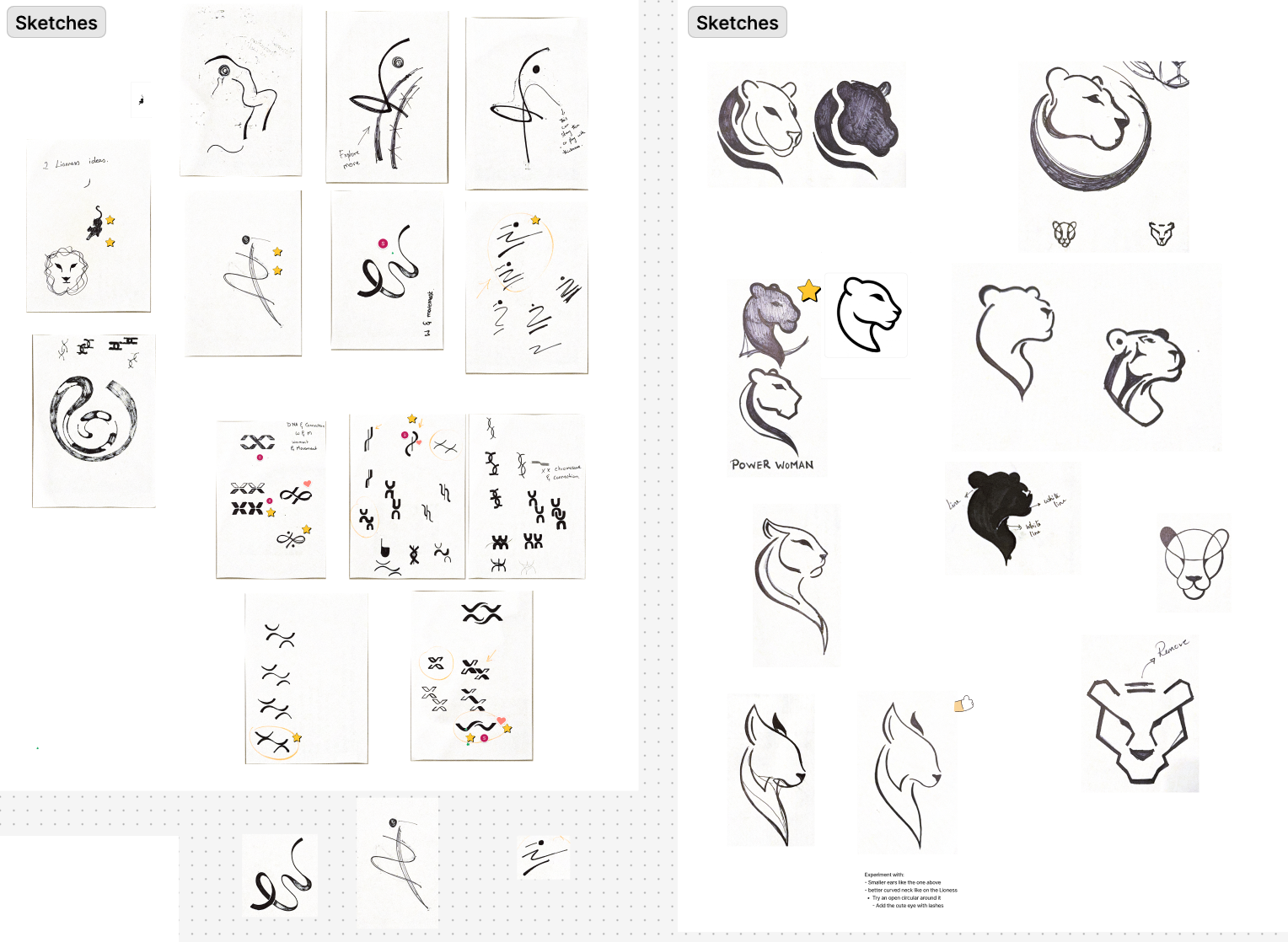
We ran a Crazy 8s session on the logo with the full team together, giving everyone a chance to contribute creatively before splitting into focused sub-teams: storytelling, colour and typography, and packaging and logo, all staying in close, regular communication throughout.
We narrowed the logo options down to a shortlist to present to the client. One of the logos — one I personally liked — was almost left out of the presentation because the team felt it was a bit too far outside the box. At the meeting, I decided to show it anyway; it felt worth the risk. It’s the one the client chose.
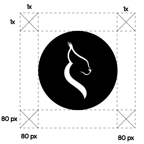
The concept started as a lioness: a symbol of power and wisdom. But in early logo drawings, it read as distinctly male and masculine, which wasn’t the direction we wanted. Through further brainstorming and research, we shifted to a Scandinavian lynx instead:
“The Scandinavian lynx is a symbol of quiet strength, independence, and intuitive power. She doesn’t compete for attention, she owns her presence. She leads with clarity, moves with purpose, and rises with grace. Like the women who wear Power Woman, the lynx is powerful not because she is loud, but because she is unshakably herself.”
Storytelling
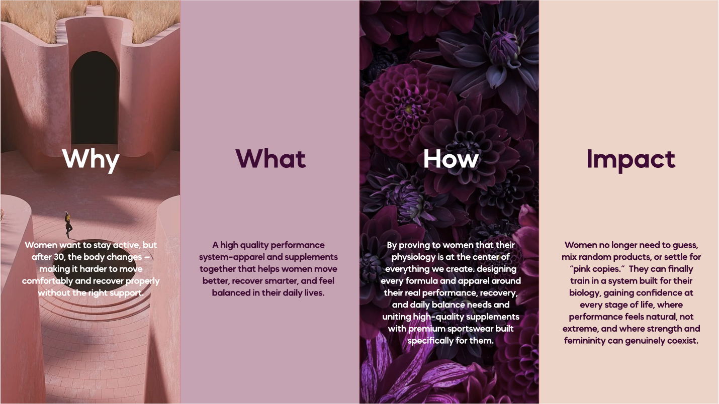
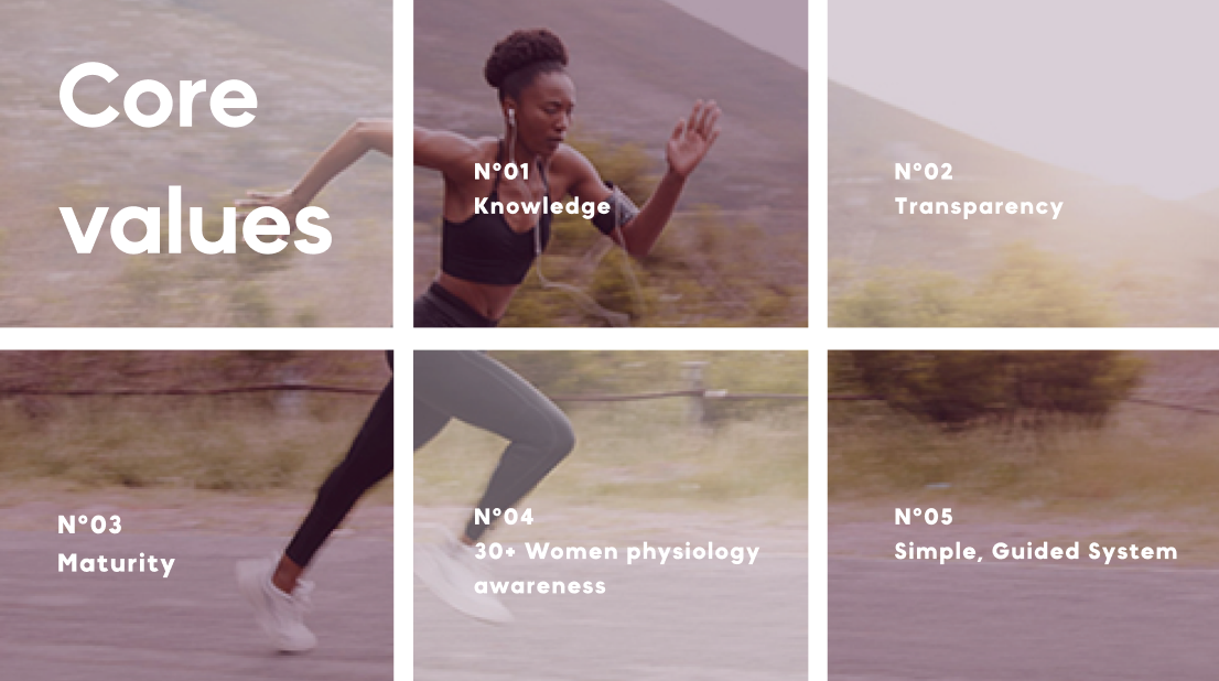
For the brand storytelling, we used the Why, What, How, Impact model to build the brand’s narrative from the ground up. From there, we defined the brand’s tone of voice and wrote a set of slogans to carry that voice across the identity.
Packaging direction
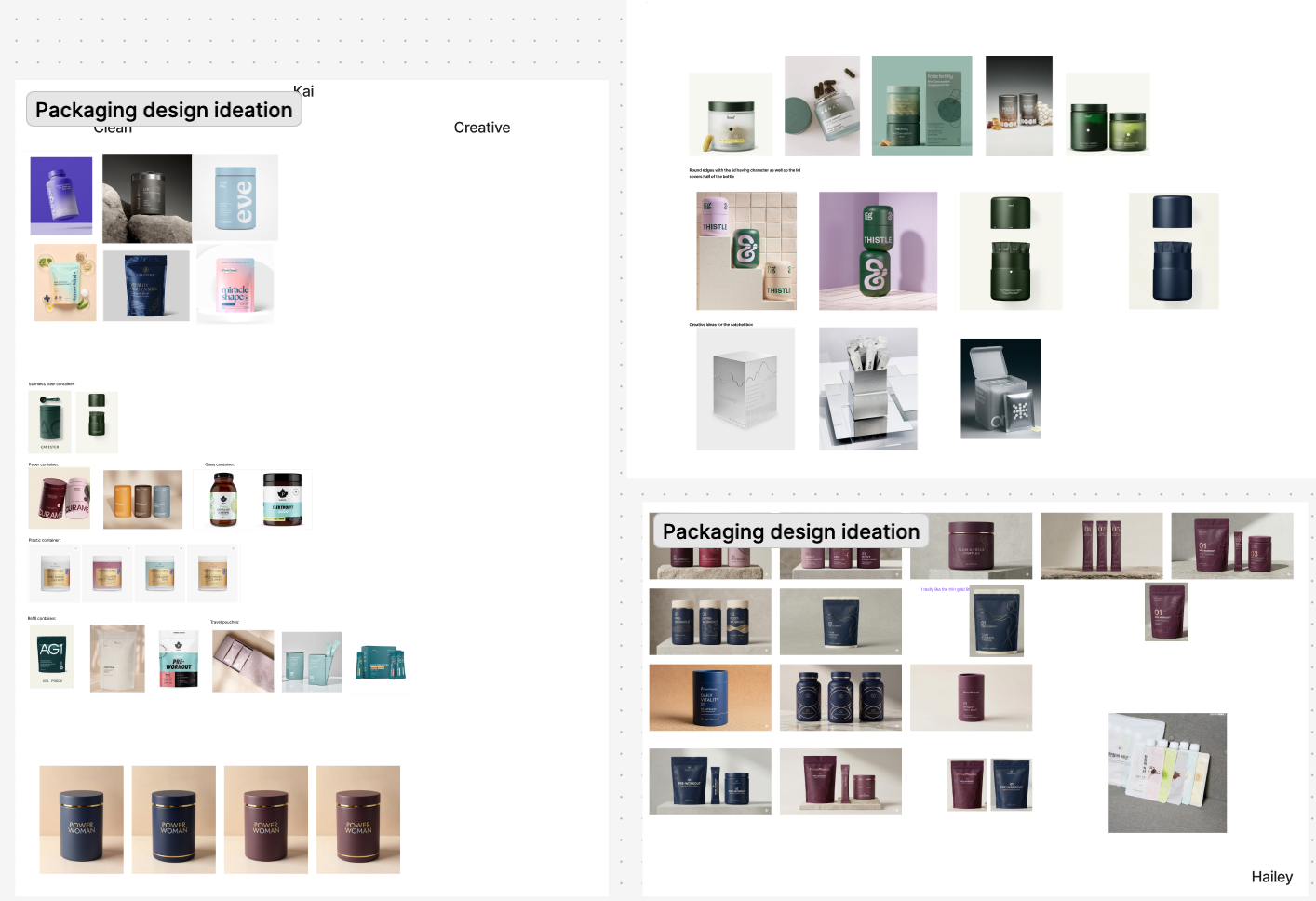
For the supplement line, we developed a moodboard, then presented the client with different choices, different paths on shapes, materials, transparency, and more. We asked for their input and opinions every step of the way to guide the packaging design before moving into final mockups.
4.Deliver
Complete brand book
We delivered a complete brand book, including:
- //The final logo (the lynx)
- //Colour palette, typography, and full visual identity
- //Do’s and don’ts guidelines
- //Brand storytelling and tone of voice
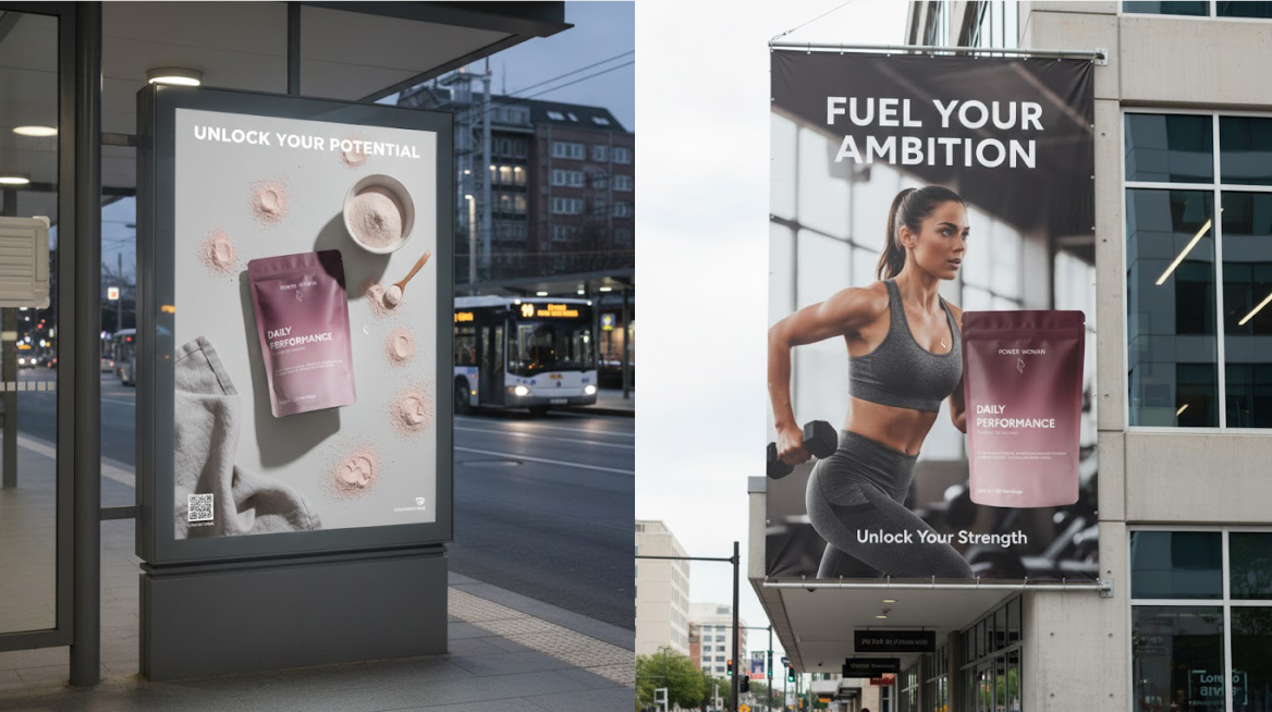
- //Application mockups
For the final presentation, I pitched using the brand’s persona, stepping into character to bring the lynx and the brand’s voice to life. A bit of theatre, but it landed well with the client.
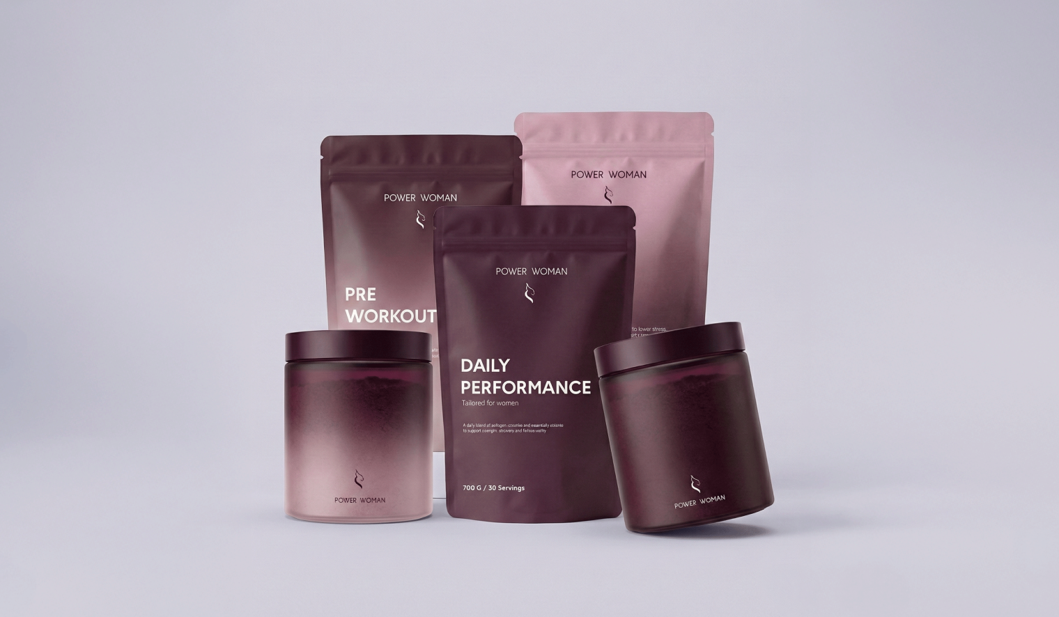
For the supplement line, we delivered packaging mockups across 3 different formats, each fully designed.
Full brand book
Client relationship
The relationship with the client was strong throughout, with weekly meetings (on-site and online), regular feedback, open communication, and enthusiasm from both sides all the way to delivery.
My Role as Project Manager
Set and managed timelines with clear deadlines throughout the 5-week sprint
Ran communication through Slack and led regular meetings with both the team and the client
Made sure major decisions were taken together as a team, using dot voting for some of the harder calls
Navigated disagreements within the team by facilitating open discussion grounded in non-violent communication, rather than letting conflict stall the work
Managed frequent absenteeism across the team, which meant constantly adjusting internal deadlines while still protecting the final delivery date, which we met
Took the call to present a logo option the team had been hesitant about, trusting my instinct on it — it ended up being the client's pick
Reflection
I learned that team members won’t always share the same opinion, and that navigating that well often just comes down to talking things through honestly and kindly. I learned to work with the unexpected, especially frequent absences that made it hard to get everyone in the same room enough. I also learned that it’s worth showing the “crazy idea” — sometimes that’s exactly the one that gets picked. Most of all, this project showed me that great work is still possible even with an imperfect team.